Good Company
A platform for knowledge transfer to support historically underserved entrepreneurs.

Good Company is a nonprofit organization that provides a welcoming platform for historically disenfranchised. They focus on the power of knowledge transfer through storytelling, mentoring, and connecting members of the community to empower disadvantaged entrepreneurs.
OVERVIEW
The goal of the project was to redesign the existing website for people to join the platform to support the underserved community by facilitating discussions and donating towards their business.
PROJECT INFO
High-fidelity prototype (Figma)
10 weeks execution time
3 person team
ROLE
Lead UX Designer
(User Research, Wireframing & Prototyping and Usability Testing)
LEARNINGS
Catalytic Questioning, Internal website review, competitive analysis, A/B testing, prototyping
The Problem
Cumbersome navigation, unorganized content and dead links can be frustrating for the users.
People need to know about the organization’s mission and vision before joining the community. The motive behind starting the organization and how it will benefit the underserved community. Good Company lacks this information on their website.
Without a discussion forum, it is impossible for members to facilitate a conversation with other users to guide and support their business.
The Design Process

Internal Research
An internal website review helped us to understand the issues with the website and we identified various problems areas such as Unorganized content and forms were consistent throughout the website. Cumbersome navigation due to a poor sitemap.
In the initial stakeholder meeting, we conducted a session of catalytic questioning with the founder to understand more about the non-profit organization.
Our focus was to get a clarity on their objective, content and their impact on the users.
Testing the website with users
Our team recruited 7 participants to perform moderated user interviews. The focus was to perform usability testing on these core tasks as those were the problem areas identified by users. We asked users to assess the ease of each task using a difficulty scale of 1 - 7.
Card Sorting was also conducted to understand participants mental model.
3 out of 7
Average usability score to learn about partners
2 out of 7
Average usability score to register for an event
6 out of 7
Average usability score to know benefits of donating
After conducting user interviews, stakeholder interviews and usability testing, I have summarized the insights below:
Participants were having difficulty to learn about the organization’s goals. Lack of human connection through the website leaded the users to doubt the benefits of joining Good Company. Poor information architecture caused a sense of frustration amongst the users. Lack of consistency in terms of text hierarchy and high quality images were also mentioned by one of the participants.
Towards the later tasks assigned in the usability testing, participants assumed the information will be missing and failed to complete the task. Participants complained that organization is asking for donation on their website without providing any background information.
Insights
Competitive Analysis
We selected 3 non-profit organizations and conducted a comparative analysis to understand what aspects were lacking in Good Company’s website. The features were also based on the user preferences from the user interviews.
The competitors were introduced to us during our market research and one of them was also mentioned during a user interview. The competitor’s website showcased their company history and connected well with their audience. In good Company’s website there was great scope of improvement in terms of visual design, information architecture.
The competitors websites comprised of clear CTA’s and forms, increasing the number of clicks and engagement on the website.
Target Audience
Good Company focus on the power of knowledge transfer through storytelling, mentoring, and connecting members of our community to empower disadvantaged entrepreneurs, namely Asian, Black, Indigenous, Latinx, LGBTQ+, women, and people with disabilities.


Design
As a team, we implemented the KJ technique to brainstorm individually at first and then worked collaboratively to shortlist possible solutions for improving website navigation, organizing content and enhance the user experience.
Sitemap
We revised the sitemap to eliminate cumbersome navigation. In addition to dead links and unorganized forms, users had a tough time knowing more about the organization, their goals and about the team.
The user interviews included a card sorting activity. Card sorting helped us understand what made sense to the users and how they grouped the categories.
Below is the sitemap, designed based on the card sorting results.

Initial Sketches


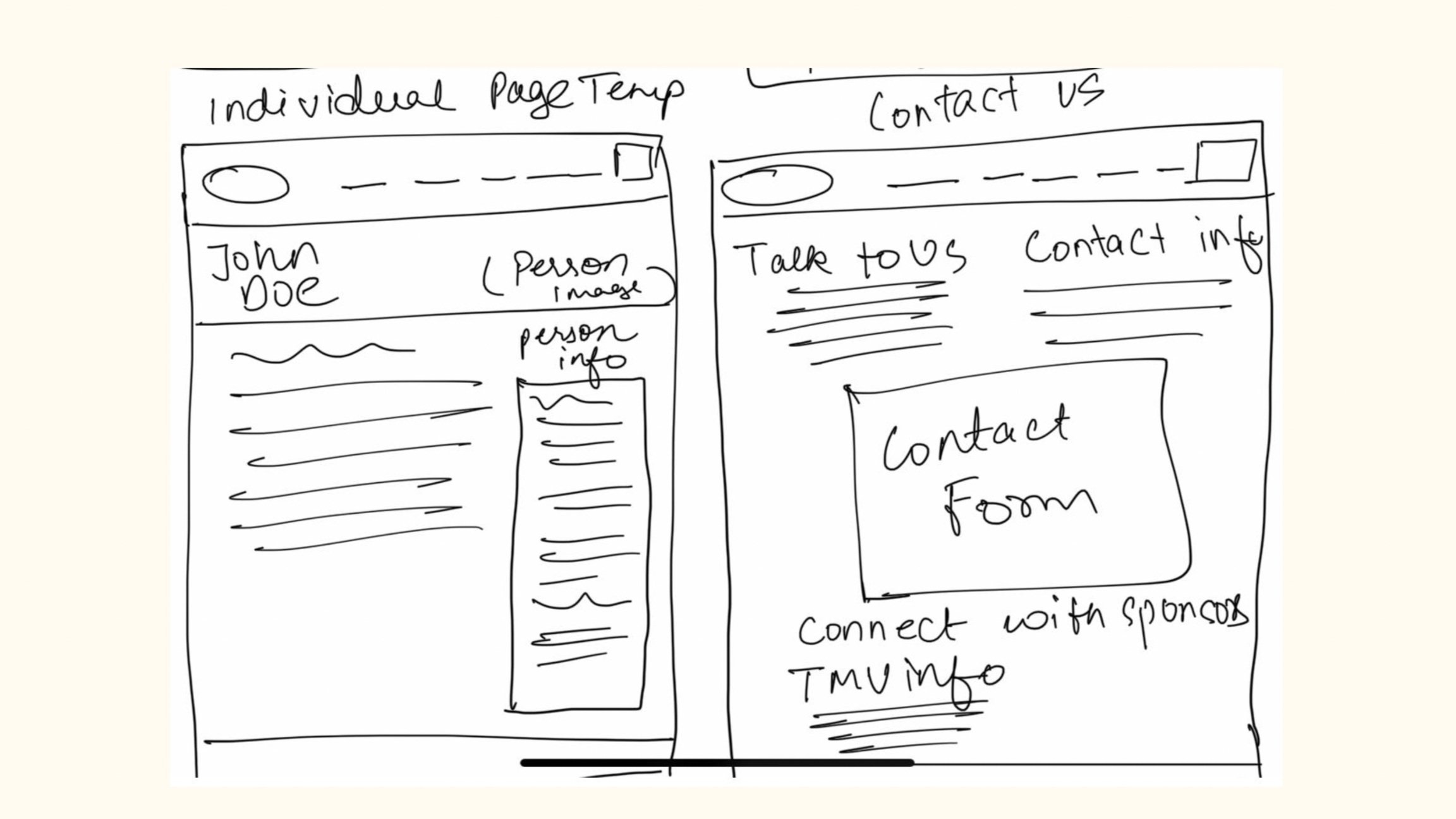
Wireframe
This phase involves implementation of the initial sketches in Figma. Initially we started with lo-fi wireframes as this was an iterative stage where the founder would validate the progress and give us feedback.
The later phase included hi-fi wireframes with images, style sheet guides, and website was well connected.
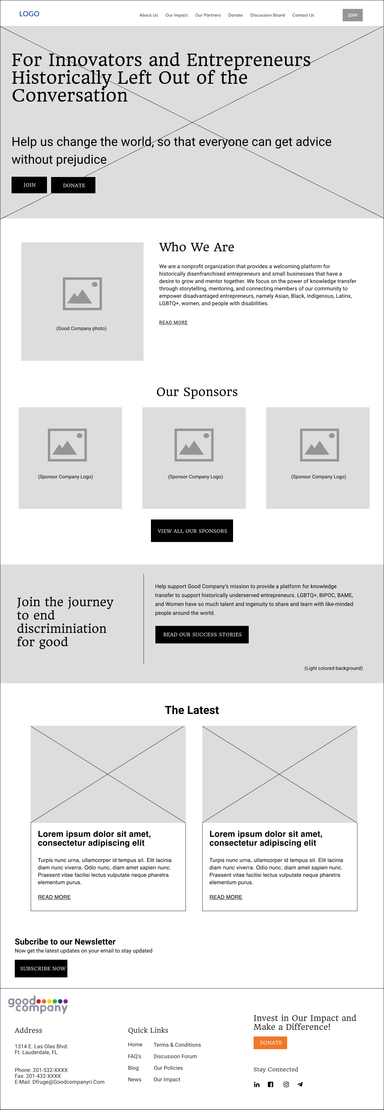


Prototype Screens


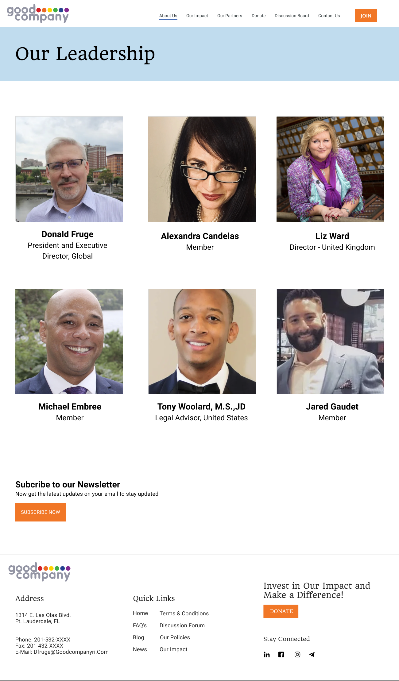
Prototype
Usability Testing
We tested our prototype in Figma with the same participants and collected the score with the same 3 core tasks. Results led to an overall usability of 86%, a 34% improvement compared to the original site (52%).
7 out of 7
Average usability score to learn about partners
4 out of 7
Average usability score to register for an event
7 out of 7
Average usability score to know benefits of donating
Results
In the previous usability testing, participants were unable to easily navigate the website to complete tasks. Participants were now satisfied with the organization’s information on the website.
The discussion forum was highly appreciated as that served the purpose of the website, where members could network and spread awareness about their business.
Project Learnings
In this project, we adopted user research techniques to understand the problem areas in the website. Most important aspect was to incorporate the insights and brainstorm with my team to sketch possible solutions that would solve all the identified pain points.
Catalytic questioning with the stakeholder allowed us to understand the business requirements and based on their goals, and user research insights we incorporated them into our design.
Seeking early and continuous feedback from stakeholders and participants played an integral aspect to deliver our final deliverable. Consistently updating the stakeholders of the progress and presenting artifacts (site map, sketches, lo-fi and hi-fi ) saved us ample of re-work and time.